| Elementary Statistics |
| |Sofia Home | Content Gallery | |
|
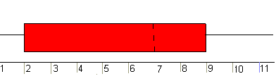
To understand the stemplot. look at the second row. You see 4 299. This represents the 42 and the two 49s. The data itself actually shows us the shape and distribution of the data. The stemplot shows us that most scores fell in the 60s, 70s, 80s, and 90s. More than half of the students received a score of 70 or better. A little less than half received a score of 80 or better. About one-fourth of the students received a score of 90 or better. Back to TopBoxplot or Box-Whisker PlotThe boxplot or box-whisker plot gives a good graphical image of the concentration of data and shows how far extreme values are from the rest of the data. It contains the smallest value, the first quartile, the median, the third quartile, and the largest value. (See Quartiles) It is used mostly, as a quick visualization, to compare at least two groups of data. Example: For the data 1, 1, 2, 2, 4, 6, 6.8, 7.2, 8, 8.3, 9, 10, 10, 11.5, the boxplot is as follows.
Notice the middle fifty percent of the data. It falls between the first and third quartiles (between Q1 and Q3). Its range (the spread) is 9 - 2 = 7. Since the smallest value is 1 and the largest value is 11.5, the middle fifty percent is fairly spread out. The spread for each quarter is as follows:
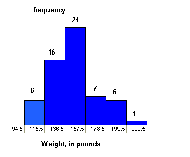
The second quarter has the largest spread of data while the first quarter has the smallest. Back to TopHistogramA histogram is a graph that consists of contiguous boxes. The horizontal axis is labeled with the data and the vertical axis is labeled with frequency or relative frequency. (Recall from Lesson 1 that frequency is the number of times a result occurs.) A histogram gives us a good idea of the shape and distribution of the data. We can see where data is concentrated and where it is spread out. We can see if the data is skewed to the right or left. To understand how to construct a histogram, let's look at the weights of 60 college statistics students. List of weights, in pounds: 140, 140, 147, 121, 165, 135, 190, 147, 155, 163, 151, 195, 137, 160, 155, 153, 145, 112, 116, 120, 135, 131, 118, 125, 122, 150, 102, 95, 133, 150, 108, 157, 130, 185, 156, 172, 220, 150, 155, 150, 150, 180, 163, 137, 162, 148, 155, 140, 182, 110, 105, 160, 130, 133, 136, 155, 125, 127, 142, 180. We can summarize the data in a frequency table (see Lesson 1). If we order the data from smallest to largest, we find that the smallest weight is 95 pounds and the largest weight is 220 pounds. We choose to create six equal intervals of data and we want our data to fall between the end-points of the intervals. So, our chosen starting point is 94.5, a half-pound below the smallest weight. Our chosen ending point is 220.5, a half-pound above the largest weight. NOTE: Some histogram intervals are chosen to include either the lower endpoint or the upper endoints. TI-83 or TI-84 calculators' default histograms have the lower endpoint included in the interval (but not the upper endoint). To find the width of each interval, we find (220.5 - 94.5) and divide by 6. Our width is 21 pounds. We can summarize this information in a table.
From the information in columns 1 and 2, we can create a frequency histogram. The horizontal axis is labeled with the data (Weight in Pounds) and is scaled with the intervals that are in the table. The vertical axis is labeled with the frequency and is scaled accordingly.
We can also choose to create the histogram differently. Suppose we choose to create a frequency histogram with eight bars and, again, we want all weights to fall between the endpoints of the intervals. This time we choose to start at 94.1 and end at 220.1. When we divide (220.1 - 94.1) by 8, we get 15.75 as the width of each interval. Our frequency table is as follows:
Think About ItTry sketching, by hand, a histogram with 8 bars from the table above. Scale the x-axis with the Interval of Weights and the y-axis with the Frequencies. Usually histograms have from 5 to 15 bars, but not always. Too few bars clump all the data together. Too many bars make it difficult to notice the important trends. One purpose of a histogram is to show you the "shape" of the data. Is the histogram mound shaped or rectangular? Does it have peaks and valleys or are there more data at one end or the other of the histogram? Do the data drop off or increase suddenly or is there a gradual decline or increase? Histograms and boxplots are usually created by using technology. Below, you will see an example of a histogram created by using TI-83 or TI-84 calculators. Histogram and Boxplot Created by the TI-83Example The following example shows how TI-83 or
TI-84 calculators create a histogram and a
boxplot.
Drawing
Histograms Sample
Data
NOTE: We will assume that the
data is already entered We will construct 2
histograms with the built-in STATPLOT
application. The first way will use the
default ZOOM. The second way will
involve customizing a new graph. Step 1. Access graphing
mode. [STAT
PLOT] Step 2. Select <1:plot
1> To
access
plotting - first graph. Step 3. Use the arrows
navigate go to <ON> to
turn on Plot 1. <ON> , Step 4. Use the arrows to
go to the histogram picture and
select the histogram. Step 5. Use the arrows to
navigate to <Xlist> Step 6. If "L1" is not
selected, select it. [L1]
, Step 7. Use the arrows to
navigate to <Freq>. Step 8. Assign the
frequencies to [L2]. [L2]
, Step 9. Go back to access
other graphs. [STAT
PLOT] Step 10. Use the arrows to
turn off the remaining plots. Step 11. Be sure to
deselect
or clear all equations before graphing. To deselect equations: Step 1. Access the list of
equations. Step 2. Select each equal
sign (=). Step 3. Continue, until all
equations are deselected. To clear equations: Step 1. Access the list of
equations. Step 2. Use the arrow keys
to navigate to the right of each
equal sign (=) and clear them. Step 3. Repeat until all
equations are deleted. To draw default
histogram: Step 1. Access the ZOOM
menu. Step 2. Select <9:ZoomStat> Step 3. The histogram will
show with a window automatically
set. To draw custom histogram: Step 1. Access [WINDOW] Step 2. Xmin
= -2.5 _
Xmax =
3.5 _
Xscl =
1
(width of bars) _
Ymin =
0 _
Ymax =
10 _
Yscl =
1
(spacing of tick marks on y-axis) _
Xres =
1 Step 3. Access [GRAPH] Drawing
Boxplots Step 1. Access graphing
mode.[STAT
PLOT] Step 2. Select <1:Plot
1> to
access
the first graph. Step 3. Use the arrows to
select <ON> and
turn on Plot 1. Step 4. Use the arrows to
select the box plot picture and
enable it. Step 5. Use the arrows to
navigate to <Xlist> Step 6. If "L1" is not
selected, select it.[L1]
, Step 7. Use the arrows to
navigate to <Freq>. Step 8. Indicate that the
frequencies are in [L2] Step 9. Go back to access
other graphs. [STAT
PLOT] Step 10. Be sure to
deselect
or clear all equations before graphing using
the
method mentioned above. Step 11. View the box plot.[GRAPH] Please continue to the next section of this lesson.
Back to Top
Up » 2.1 Graph » 2.2 Quartiles and Percentiles » 2.3 Mean, Median and Mode » 2.4 Variance and Standard Deviation |
 A stem-and-leaf graph or stemplot
comes from the field of exploratory data analysis.
This type of graph is a good choice if the data
set is small. You use the data to create the graph
by dividing each observation of data into a stem
and a leaf. The leaf consists of one digit and the
stem consists of the remaining digits. For
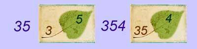
example, 35 has stem 3 and leaf 5. The number 354
has stem 35 and leaf 4.
A stem-and-leaf graph or stemplot
comes from the field of exploratory data analysis.
This type of graph is a good choice if the data
set is small. You use the data to create the graph
by dividing each observation of data into a stem
and a leaf. The leaf consists of one digit and the
stem consists of the remaining digits. For
example, 35 has stem 3 and leaf 5. The number 354
has stem 35 and leaf 4.