|

Lesson 12.2 Scatter Plots
Scatter Plots, in General
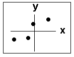
The most common way to display the relation between two variables x and y is with a scatter plot. A scatter plot is just points plotted on an x-y graph. The following graph is a scatter plot.
Direction and Strength
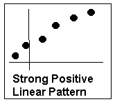
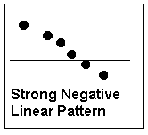
A scatter plot shows the direction and strength of a relationship between the variables. A clear direction happens when one of the following is true:
- high values of one variable occur with high values of the other variable.
- low values of one variable occur with low values of the other variable.
- high values of one variable occur with low values of the other variable.
If the points appear close to a line, a power function, an exponential function, or some other known function, then there is generally a strong relationship between the variables.
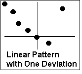
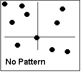
It is the overall pattern and any deviations that are important in a scatter plot. We are interested in scatter plots that show a linear pattern, particularly a strong one.
Please continue to the next section of this lesson.
Up » 12.1 Linear Equations » 12.2 Scatter Plots » 12.3 The Regression Equation » 12.4 The Correlation Coefficient » 12.5 Prediction » 12.6 Outliers » 12.7 TI-83
|